AARU BRANDING
Inspired by Aaru, the paradise of Egyptian mythology, this branding represents the fullness of being and the pursuit of perfection. Just as Aaru symbolized rest and the soul’s fulfillment after its journey, this visual identity reflects balance, transcendence, and the promise of a space where the self reaches its highest expression—through harmonious colors and symmetrical forms that bring it all together.
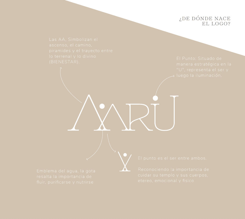
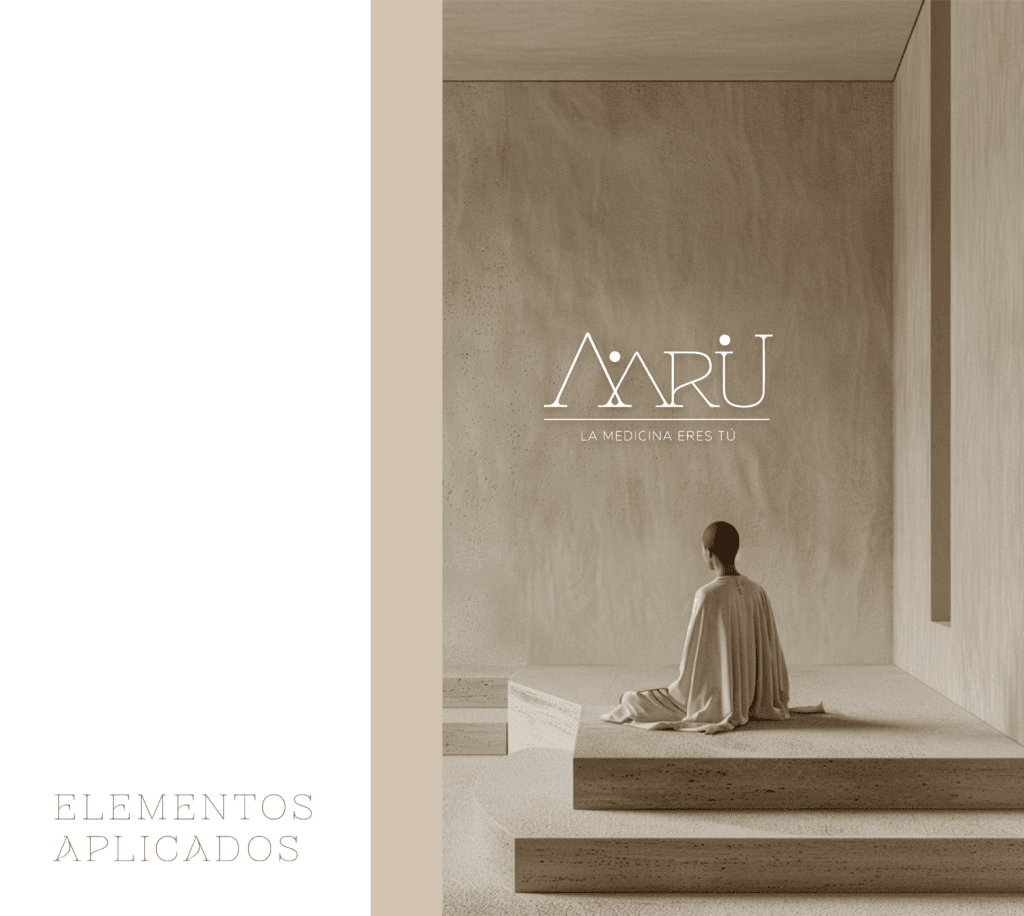
Every element in this branding was meticulously designed to visually embody the essence of this concept. From the geometry that evokes sacred alignment, to the textures and tones that speak of calm, wholeness, and inner clarity, each decision was intentional.
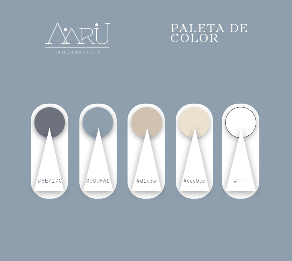
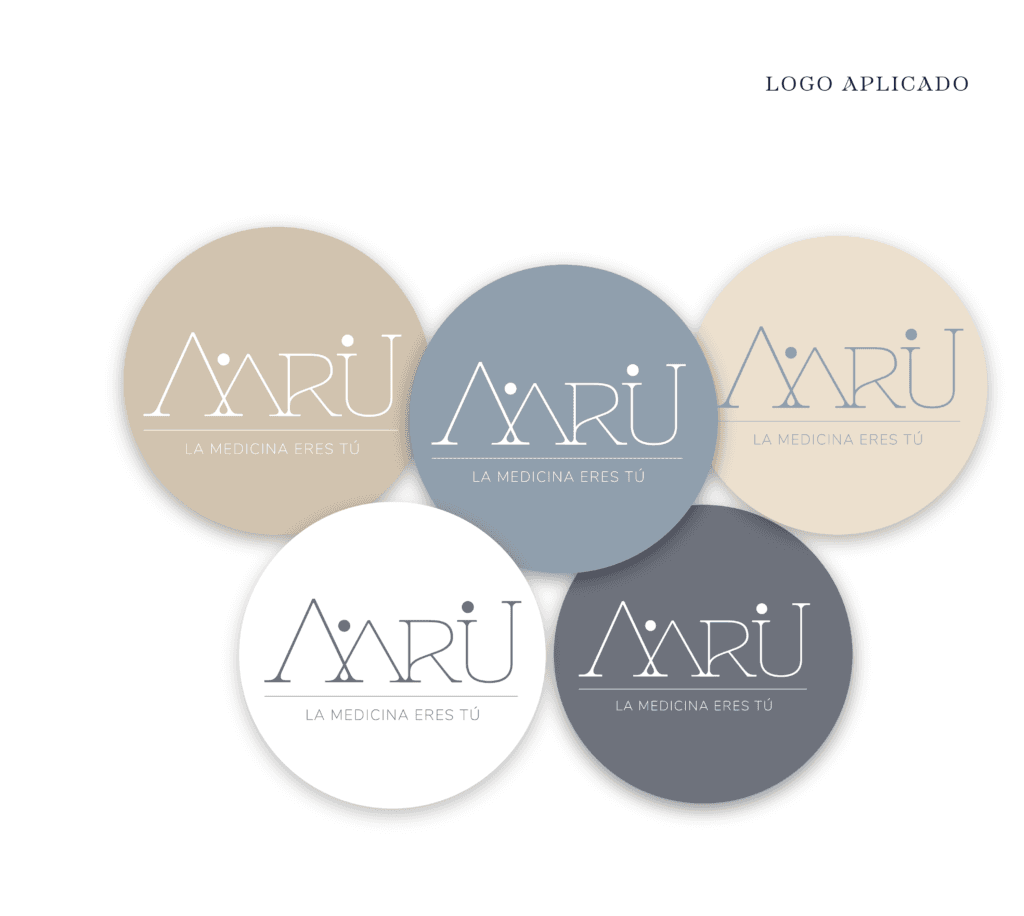
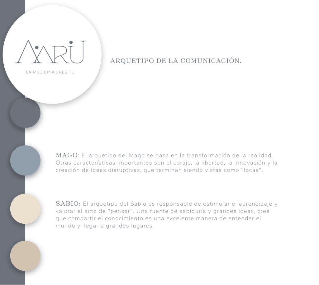
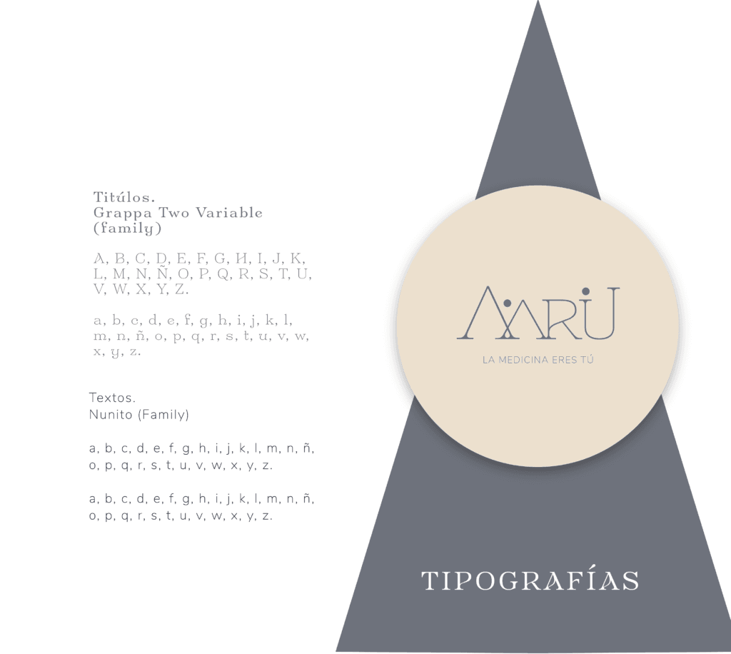
Typography flows with quiet strength, while the palette—earthy, golden, and timeless—grounds the brand in elegance and spiritual depth. This is a visual language that does more than communicate; it invites. It opens a door to something higher, more serene, and complete.
No Comments yet!